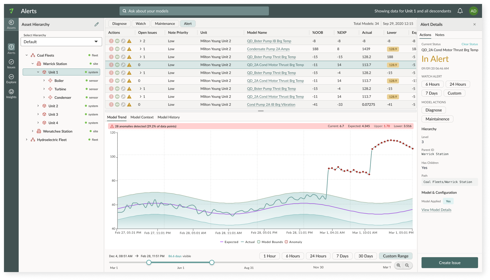
A design system purpose built for industrial diagnostics, started as a UI kit with static components, but evolved into a framework of token architecture that spans tools and disciplines purpose built for moving raw data to confident action.
When Atonix separated from Black and Veatch, BV retained Asset360, its dark theme, and its entire color palette. Atonix kept the Monitoring and Diagnostics product and nothing else. A new visual direction was required from scratch.
Monitoring provided real-time visibility. Diagnostics delivered predictive insight and recommended action. But the two lived in disconnected experiences. Operators carried context manually between them at exactly the moment they could least afford the friction.
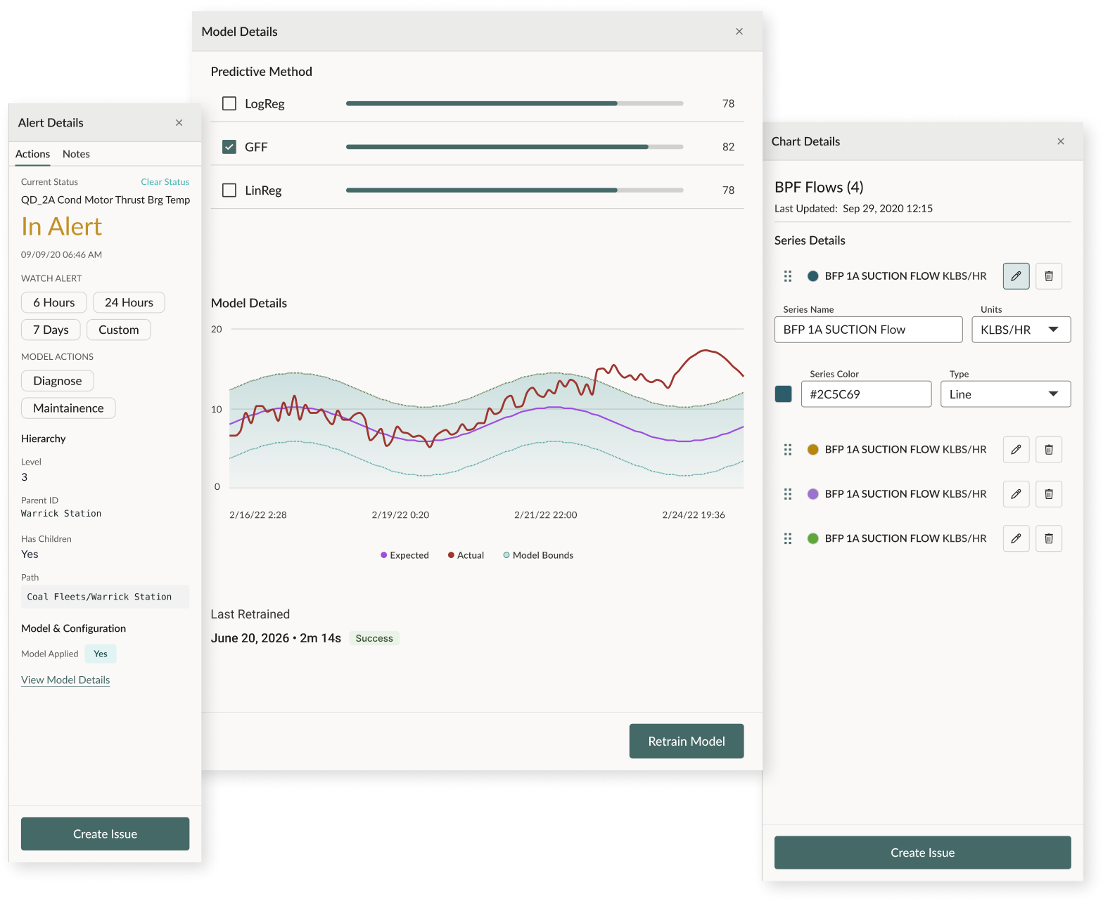
A systematic review of every screen surfaced the same story: no button architecture existed, and engineers were solving the same interaction differently screen to screen.
Engineering agreed: Get these right and the system has something solid to stand on. DesignOI was created.
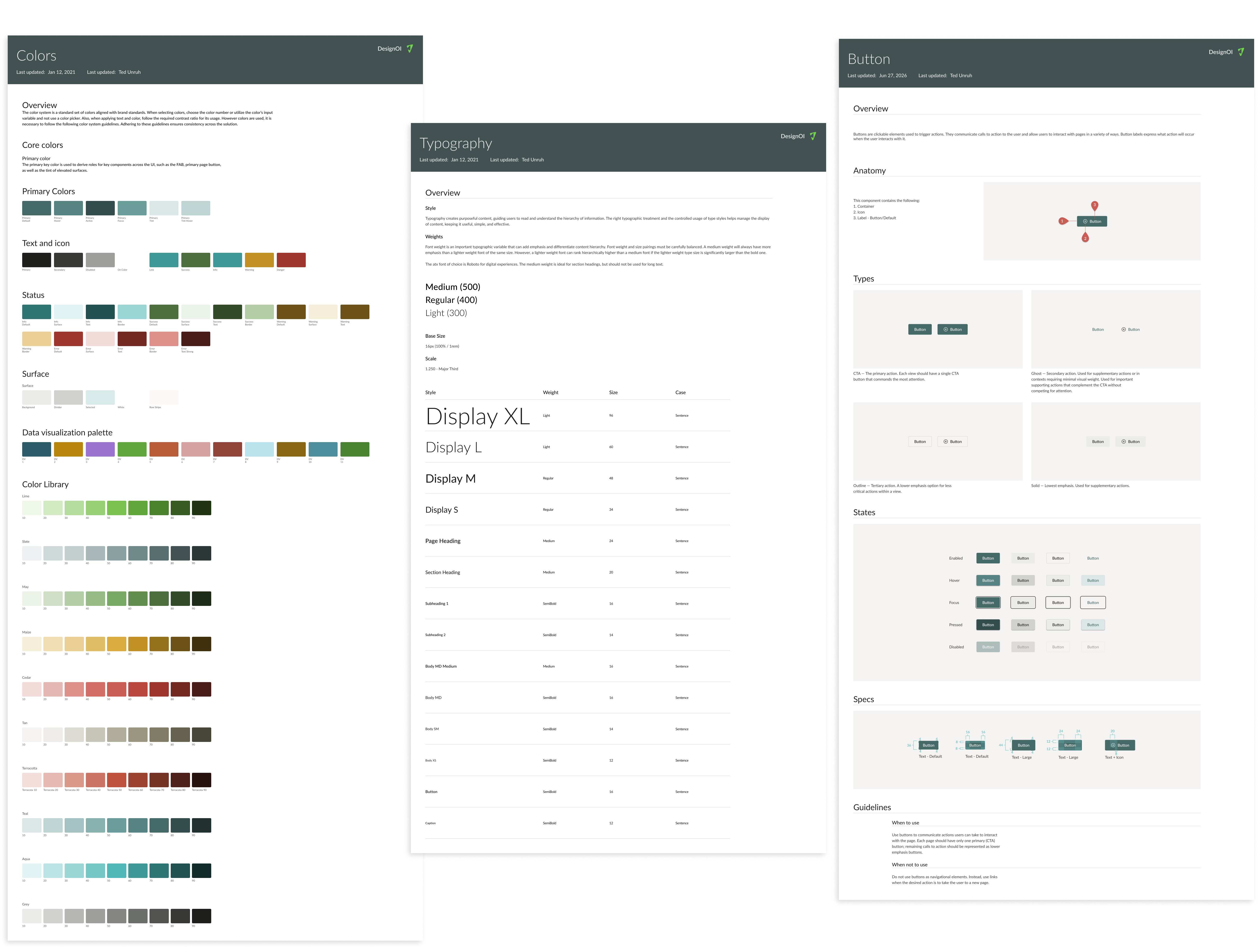
Each component was validated in both places before it was done. Figma for spec and Storybook for working code. Catching gaps between what was spec’d and what was built before they reached a shipped feature.
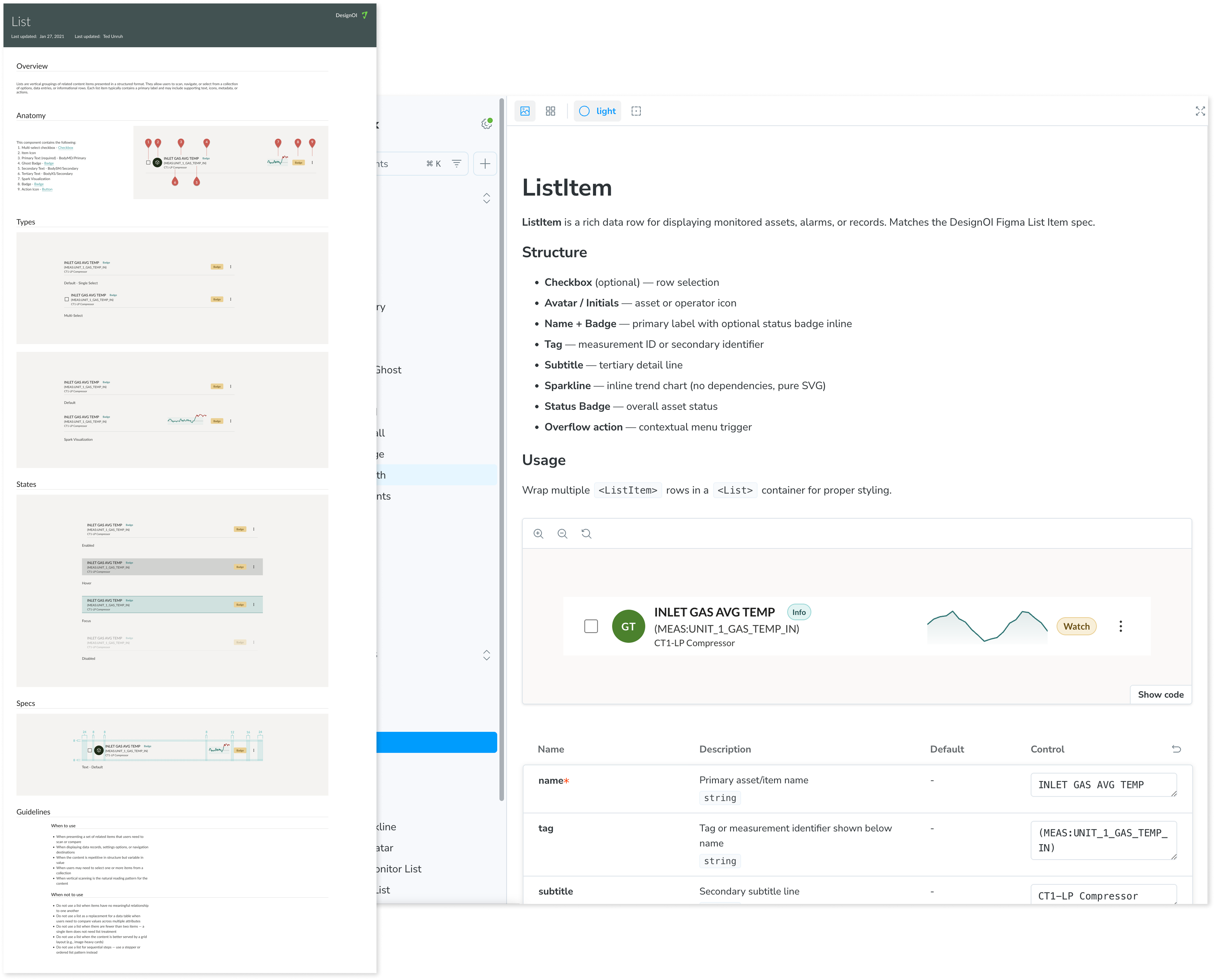
Together with the head of engineering we recognized we were beginning to duplicate patterns. As solutions and the road map was extending it was the right time to make component, patterns, and templates real.
Built component docs engineers could use without a designer present. Usage rules, anatomy guidelines, and visual specs, Lowered the cost of doing it right.
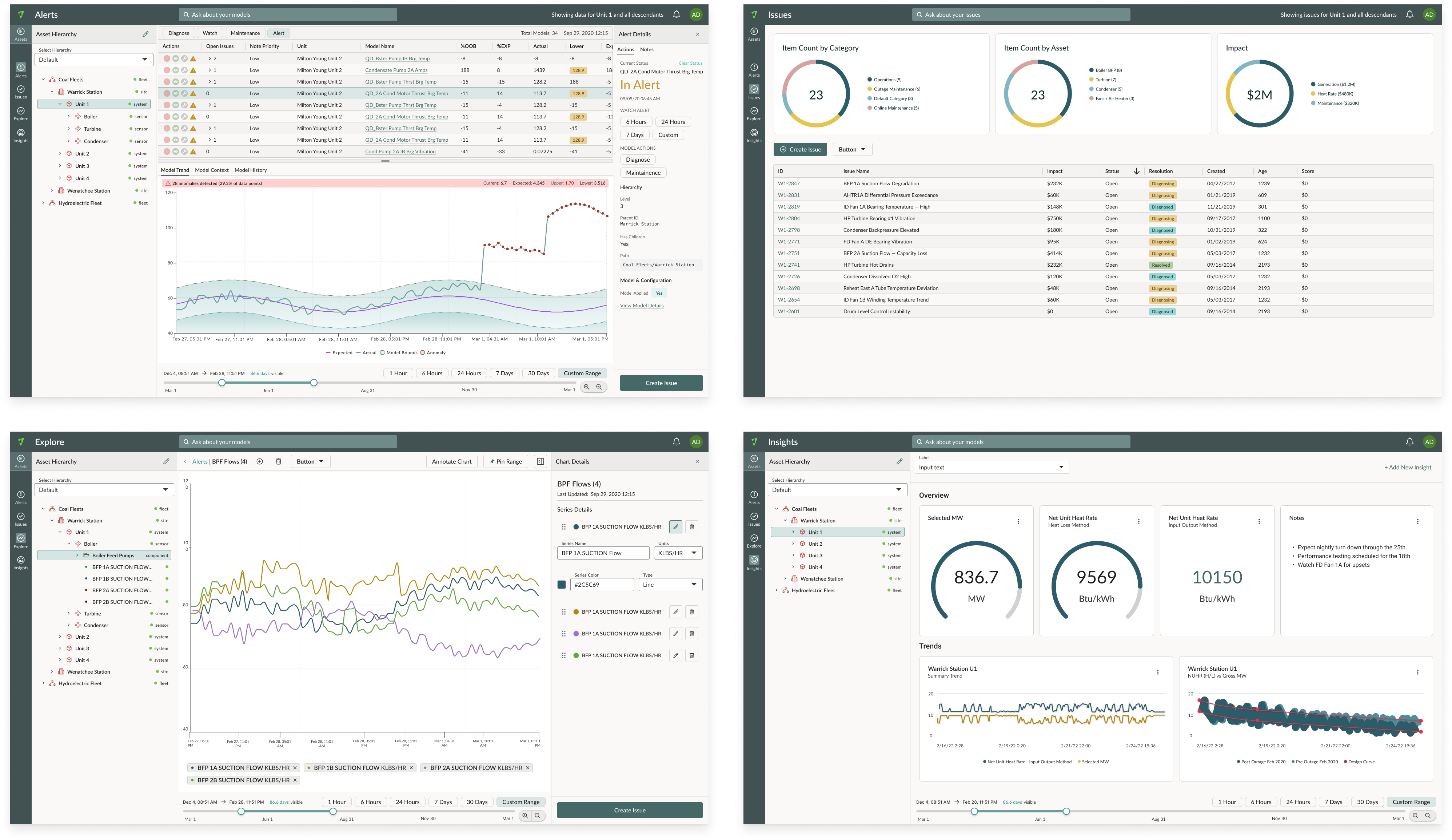
DesignOI shipped as a documented component library with Storybook implementation. That solved the immediate problem. But a static system still requires human maintenance, tokens drift, specs go stale, handoff breaks down.
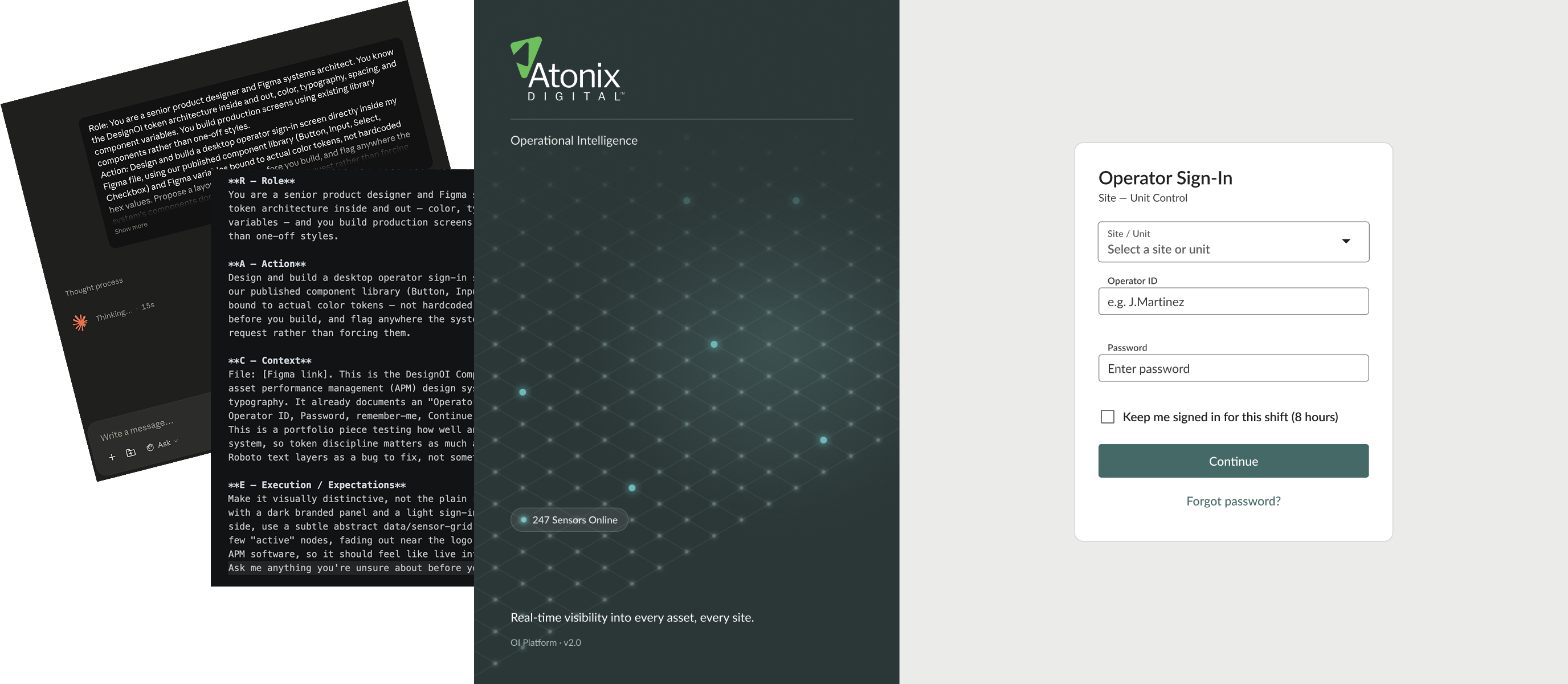
component-library.md A living spec any tool can read.The proof: the Operational Intelligence login screen below was designed entirely through conversation — no traditional Figma workflow, no manual spec documents. A prompt describing the intent, the DesignOI system spec, and Figma variables did the rest. Brand-compliant. Token-accurate. Production-ready.
DesignOI didn't stop at the design system. The token architecture and component-library.md became the foundation for a production React component library, built using AI-assisted tooling to close the gap between Figma and engineering permanently.
The Figma component library was connected directly via MCP, allowing Claude to read actual token values, component states, and variant structures rather than working from documentation. The result is a system where the design and the code are derived from the same source.
What was built
| Deliverable | Detail |
|---|---|
| Design token system | Color scales, type styles, spacing, shadows. All extracted from Figma into CSS custom properties and W3C token JSON |
| React component library | 14 components built to exact Figma specs with TypeScript APIs and Storybook documentation |
| Figma Code Connect | Every component wired to its Figma counterpart. Developers see real import syntax in Dev Mode |
Components built: Button, Badge, Input, Select, Checkbox, Switch, Card, Tooltip, Dialog, Tabs, Notification Toast/Banner, Chip, Table, Navigation Rail
DesignOI worked because it was designed around a specific cognitive model, not because it had a comprehensive component library. The framework came first. The components followed.
I'm currently open to new design leadership roles. Whether you're building something ambitious or improving what you already have,I'd love to connect.
Get in touch