A full patient portal for a Denver-based spine surgery practice from brand identity through mobile app design, component system, and on-demand recovery coaching.
Colorado Spine needed a patient-facing digital presence that matched the quality of their clinical care. The practice had no existing digital product just a static marketing site.
The challenge: design a full mobile portal that earns patient trust, reduces administrative burden, and introduces an on-demand recovery coach without overwhelming or alarming users. Everything brand, app, system was built from scratch.
Spine surgery patients face a long, anxiety-inducing recovery. They have more questions than their care team has time to answer.
They struggle to track their own progress. When they can't reach their doctor, they guess sometimes dangerously. The portal had to close that gap without replacing the clinical relationship.
The gap between what patients needed and what existing tools offered mapped across the full recovery arc.
Four core surfaces each with a single job, designed to work as a coherent whole.
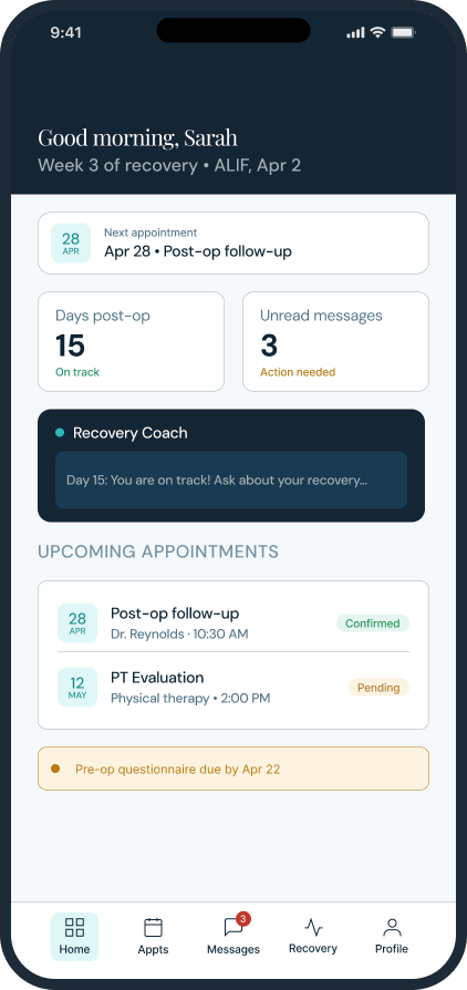
Dashboard At-a-glance recovery status, next appointment, AI coach access
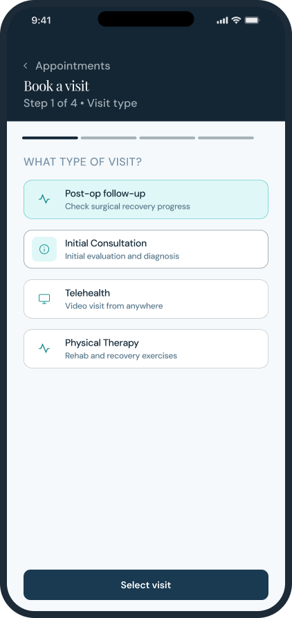
Booking Flow 4-step appointment booking: type → provider → date → confirm
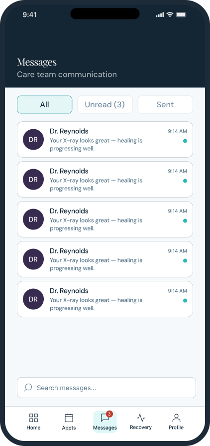
Messages Threaded inbox with unread indicators and direct care team chat
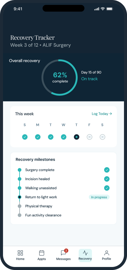
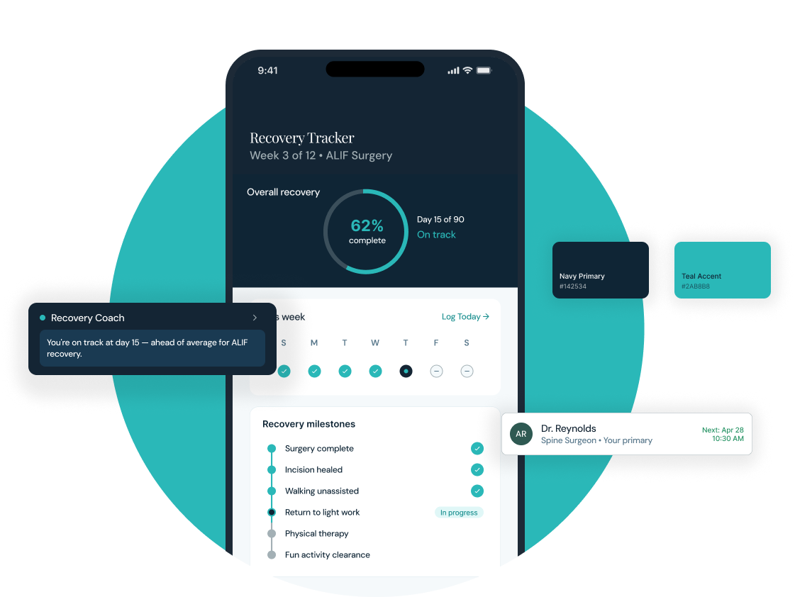
Recovery Tracker Progress ring, weekly check-ins, and milestone timeline
Every significant design decision was a tradeoff between intelligence and trust, between richness and clarity, between clinical authority and human warmth.
The Recovery Coach always available, never intrusive. Annotated to show the exact constraints that shaped its behavior.
The component library, brand board, and token structure were designed for clear collaboration at scale.
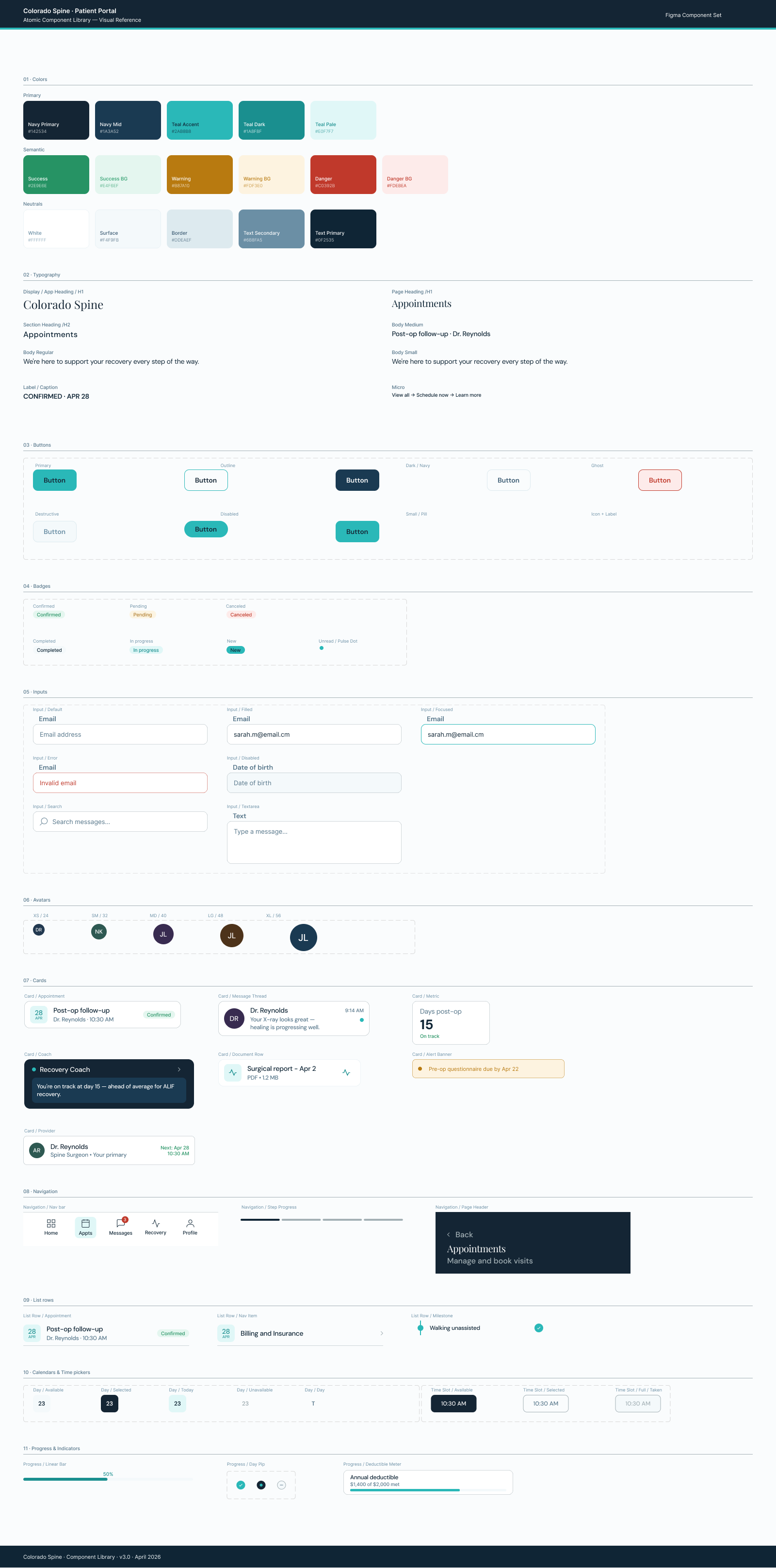
The full component library 60+ atoms, token-based, organized so any designer or developer can navigate it without a guide.
A complete patient portal brand, product, and system ready to build and ready to scale.
13+ production-ready screens covering every patient touchpoint from login to discharge.
The recovery coach a genuinely novel surface for the spine care category.
The most durable decision was building the brand before touching any screens every downstream call became easier because the constraints were already set.
I'm currently open to new design leadership roles. Whether you're building something ambitious or improving what you already have, I'd love to connect.
Get in touch