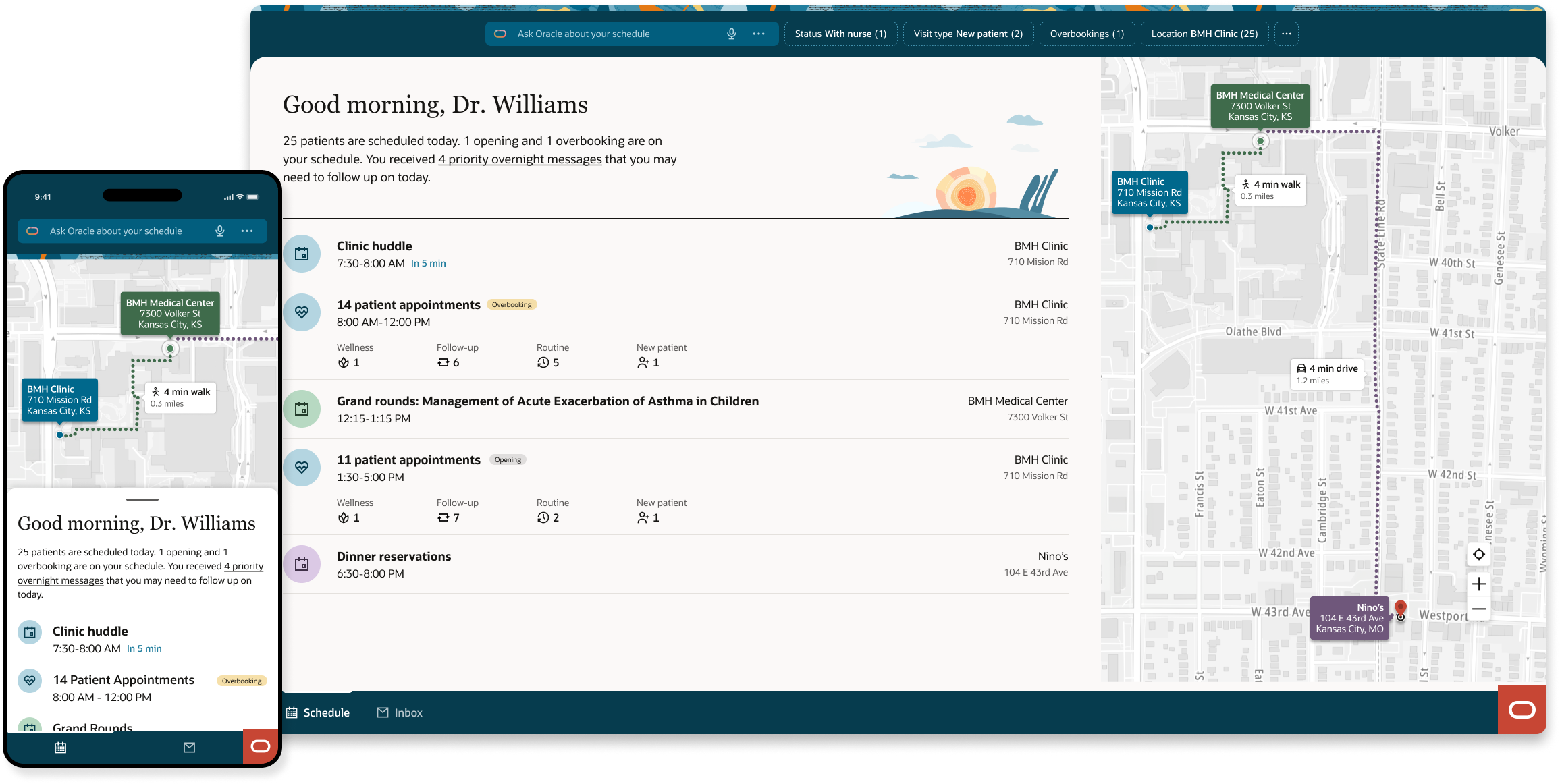
A physician seeing 25 patients a day does not have an information problem. They have a clarity problem. This is how Oracle Health solved it.
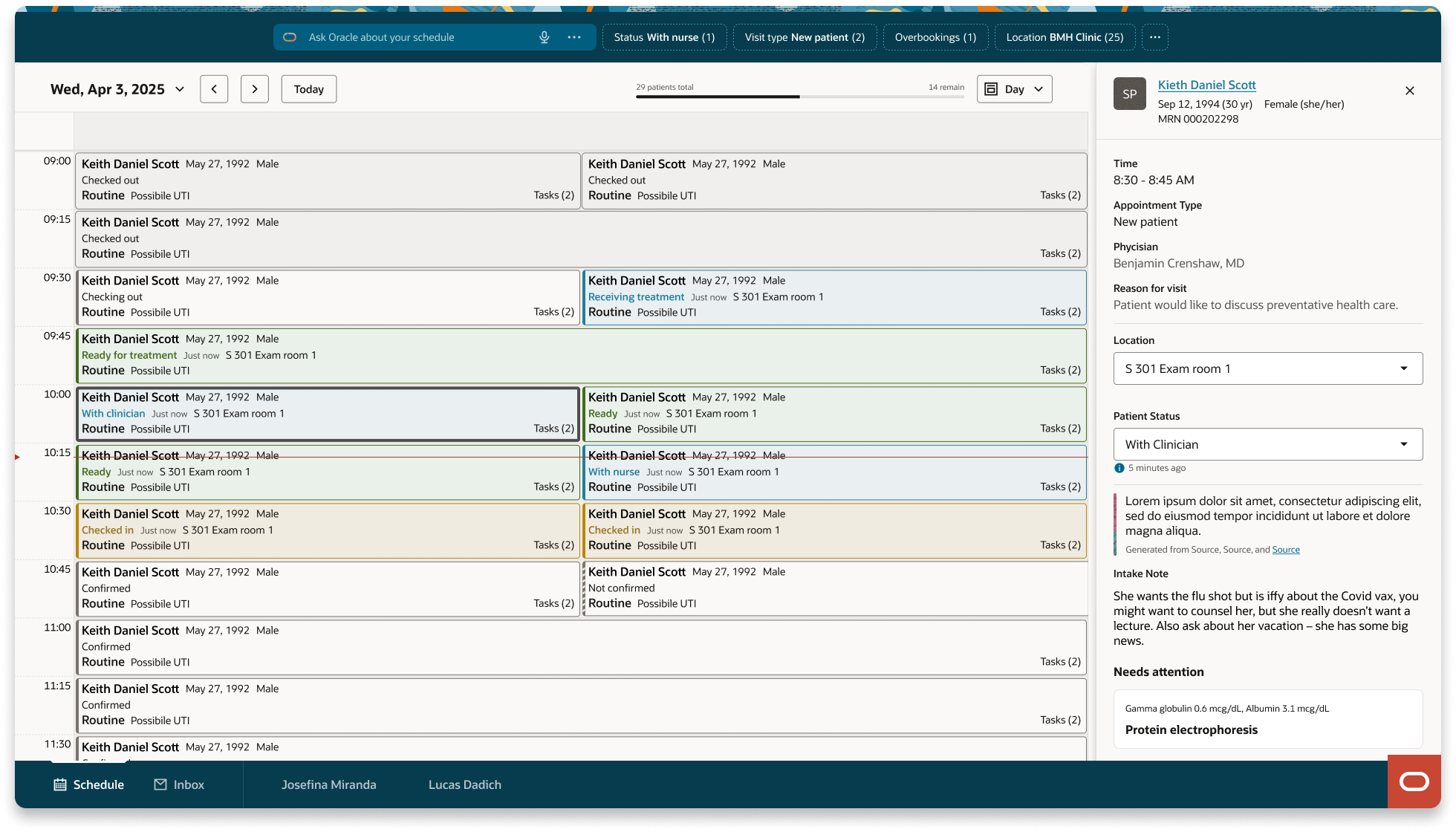
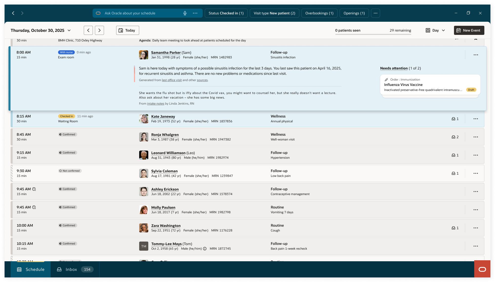
The entry point is an intelligent summary of the day. "25 patients scheduled today. 1 opening and 1 overbooking. You received 4 priority overnight messages you may need to follow up on today." That paragraph replaces three tabs and two tools. Below it, the day structures itself: clinic huddle, morning patient block broken down by visit type, grand rounds at a different location with travel time surfaced automatically, afternoon block. The AI filter bar surfaces what needs attention before the physician goes looking for it.
I was the principal interaction designer responsible for experience architecture, list view component design, accessibility strategy, and the cross-platform contribution that carried this work from Oracle Health into Oracle Fusion HR. I collaborated with product, engineering, a physician advisory group, and a non-sighted designer colleague whose input shaped the most consequential decision in the project.
Oracle Health and Oracle Fusion are two of Oracle's largest enterprise product lines. One serves the clinical workflows of health systems and physician practices. The other powers the HR operations of the world's largest organizations. Both needed the same thing — a scheduling experience that could surface the right information at the right moment for high-stakes, time-pressured users.
The work was built inside Oracle's Redwood Design System, Oracle's unified design language, which meant every pattern decision had to hold across both platforms without compromise. A clinician reviewing their patient schedule and a recruiter tracking a candidate's interview day are doing fundamentally different work — but the underlying cognitive demands are remarkably similar.
The component was structured around four questions in the order users actually ask them. When — time orients the day. Where — location directs movement. Who — identity confirmed on arrival. Why — reason understood in context. Each field was assigned a visibility tier and validated against both clinical and HR workflows to ensure the hierarchy held across domains.
Building inside Redwood meant the governance was structural, not social. The system enforced consistency so individual platform teams didn't have to negotiate it. The scheduling pattern was not a one-off component — it was a contribution to the system itself, establishing a reusable model for any Oracle product that needs to represent sequential, status-driven interactions involving people moving through a process.
The design follows the cognitive sequence a physician actually uses: When is my next appointment? Where is it? Who is the patient? Why are they here? That order, every time, across every view.
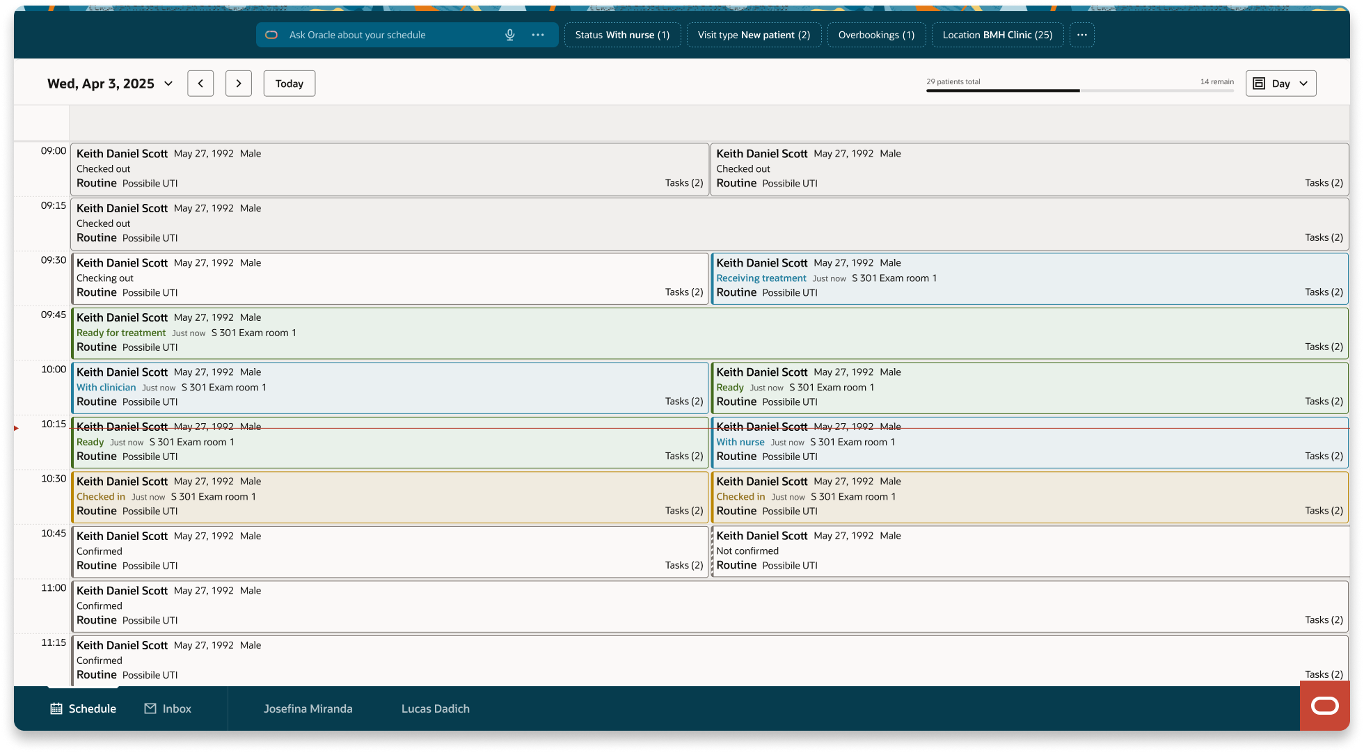
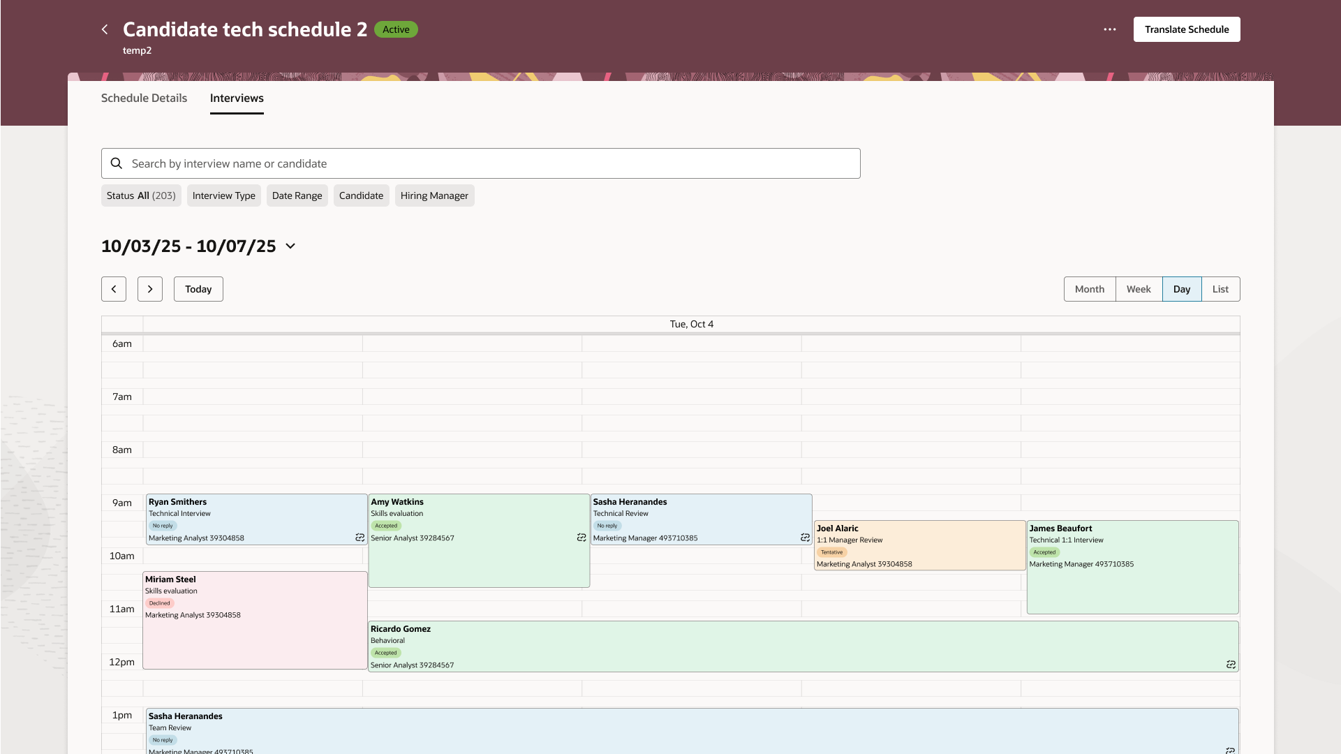
Day view — the Outlook calendar convention physicians already know. Appointments slot into time blocks, concurrent patients appear side by side, status is visible without any expansion or interaction.
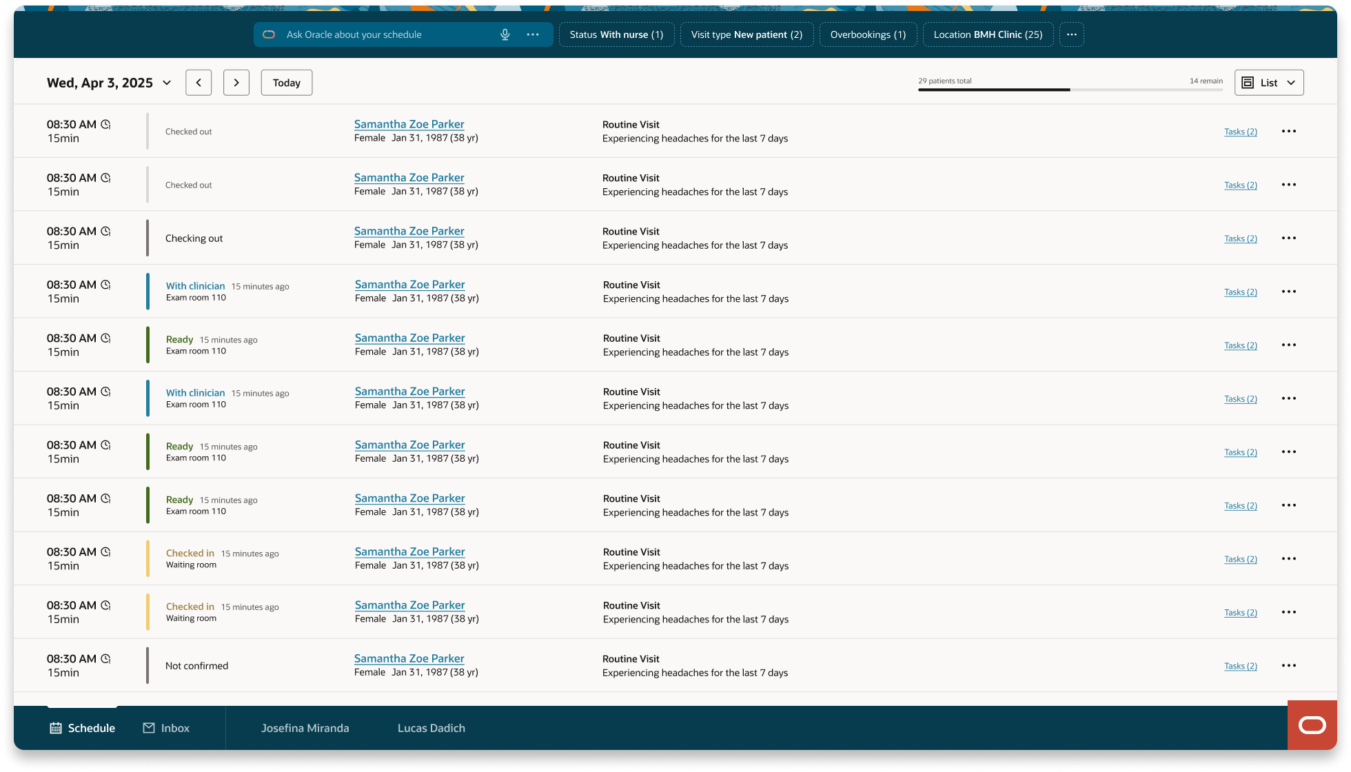
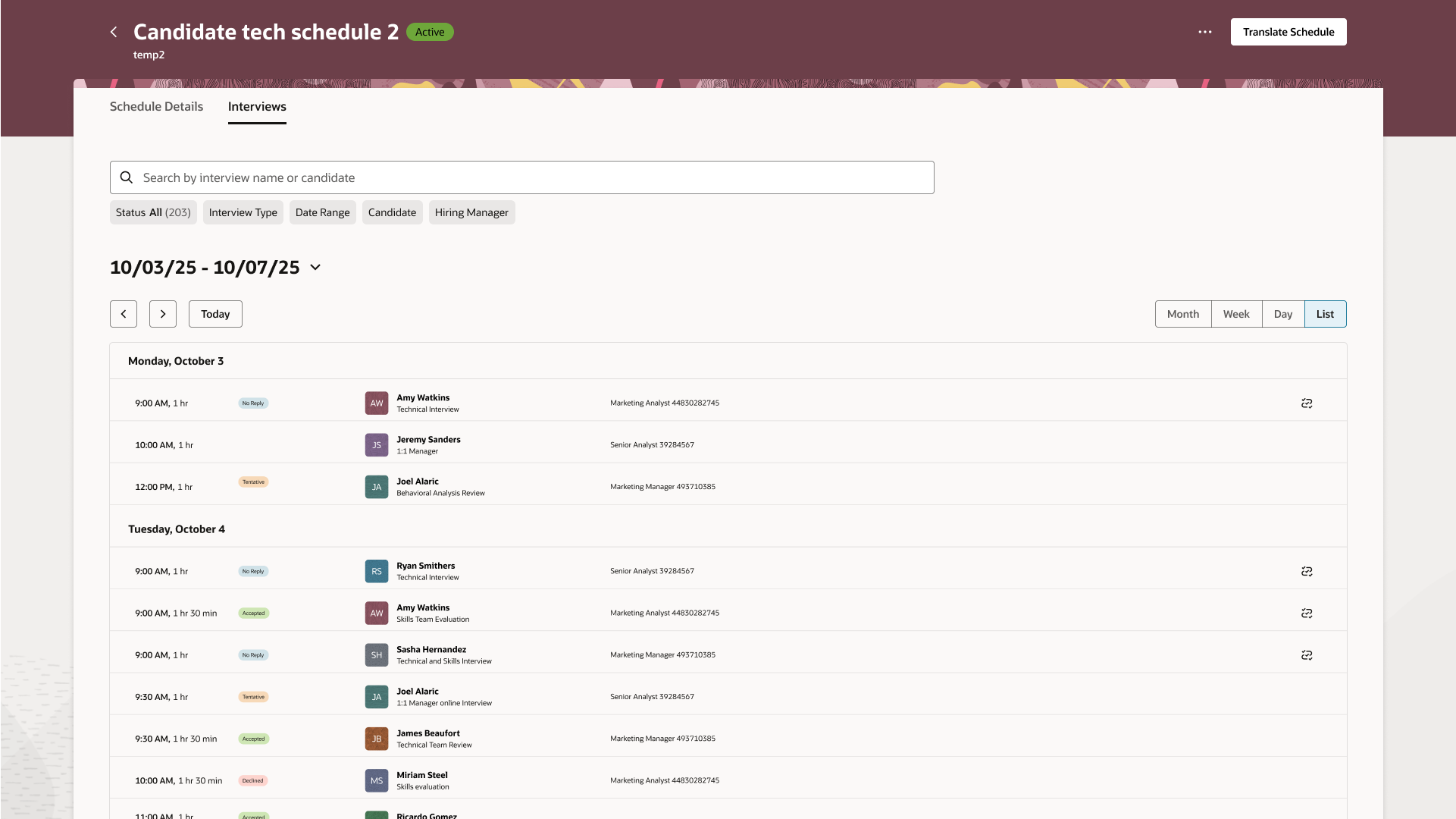
List view — designed for rapid sequential scanning. Every row carries the same information in the same position: time, status badge, patient identity including preferred name and pronouns, visit type, chief complaint, message indicator. Nothing expands. The rhythm is constant regardless of how many patients are scheduled.
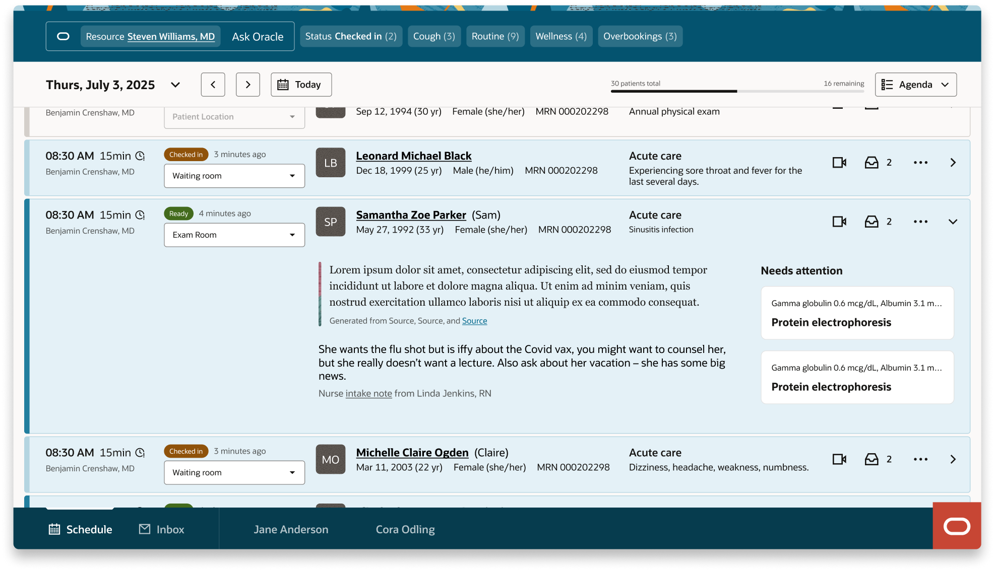
Detail drawer — selecting any row opens the drawer without displacing the list or grid. Patient photo, appointment time, reason for visit, location and status (both editable), AI-generated patient summary with sourced references, nurse intake note, pending clinical tasks. The drawer behaves identically in both views. Learn it once, know it everywhere.
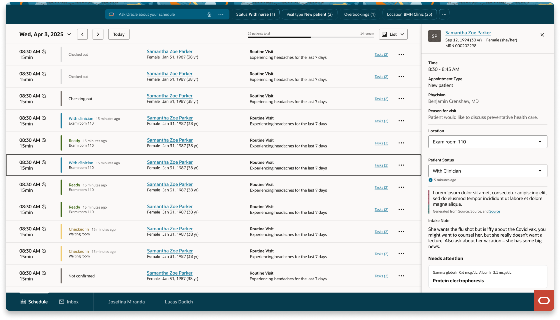
Detail drawer in list view — no list displacement on open.
Detail drawer in day view — no list displacement on open.
The original direction was a fisheye expansion model. Selecting a patient row would expand it inline, revealing AI summary, nurse notes, and pending tasks without navigating away. On the happy path it was elegant.
The original inspirational direction: inline expansion. Elegant with one row open.
The original buildable direction: inline expansion. Overwhelming with full content loaded.
As interactions were added, the expanded state became visually overwhelming. More critically, it broke the accessibility model. For a sighted physician, a crowded row is an inconvenience. For a non-sighted user navigating by keyboard, it is a wall. Tab navigation through an expanded row meant traversing dozens of focusable elements before reaching the next patient.
Her recommendation was to remove expand/collapse from the list entirely and treat detail context as a separate navigable destination — enter to go in, escape to return. We validated this by modeling the component as a pure semantic datagrid, stripping all visual design to confirm the column structure could support efficient arrow-key navigation. The final list view is a direct result of that session.
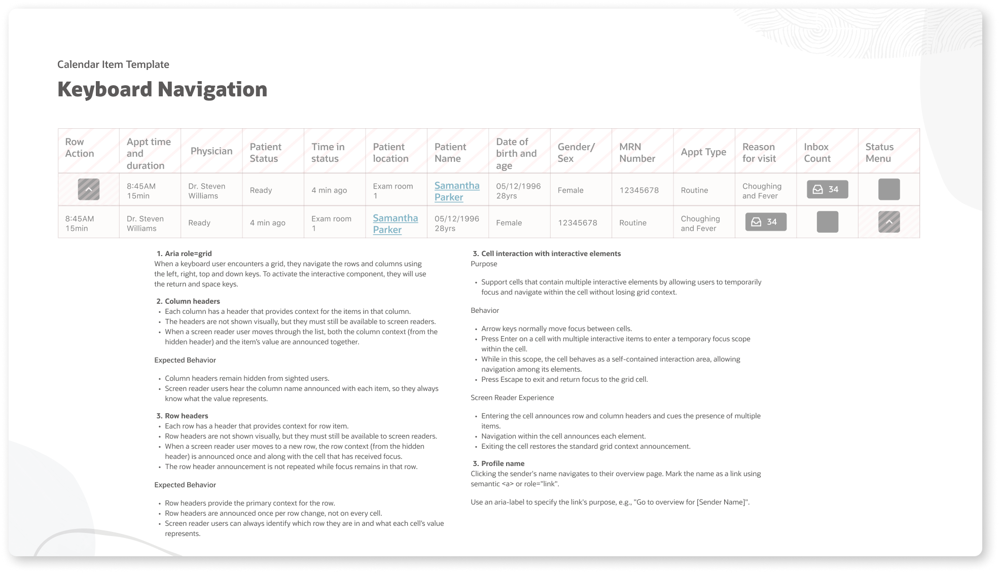
The semantic datagrid model: structure validated before visual design. Accessibility architecture first.
| Evaluation criterion | Fisheye expansion | Drawer model |
|---|---|---|
| Sighted scanning | Fast with one row open | Always fast |
| Multiple patients open | Chaotic | No degradation |
| Keyboard navigation | Tab order broken | Linear, predictable |
| Screen reader | Context lost in expansion | Consistent structure |
| Cognitive load | Visual weight varies by state | Uniform density |
The original component design used blue row highlighting to indicate active patients — those currently in an exam room receiving treatment. The intent was clear: surface who is in the building right now without requiring any interaction.
Two separate audiences pushed back simultaneously.
Clinicians pointed out that in a full outpatient day, active patients are the norm not the exception. By mid-morning, the majority of rows would be highlighted. The signal meant to draw attention would become background noise — a screen of blue that communicated nothing because it communicated everything.
Redwood Design System leadership raised a different concern: blue in the component library reads as selected state. A row that appears selected but is not creates a false affordance that directly conflicts with established system-wide interaction patterns. It would confuse users who had learned Redwood conventions across other Oracle products.
The direction shifted to status badges — compact, text-and-color tokens that communicate patient state without coloring the entire row. The list stays visually neutral. The status column carries the signal. The row only changes when something genuinely needs attention, not simply because a patient is present.
This is what designing inside a system looks like in practice. The right answer was not the most visually expressive one. It was the one that held within the constraints that already existed.
When Oracle Fusion HR needed a recruiting scheduling component, no significant accommodation was required. Their data mapped directly into the structure clinical had already validated.
Time and duration. Status badge. Candidate name and interview type. Requisition identifier. The column structure is identical. The data is different. The experience is the same. A component designed correctly for one domain serves another without modification.
Oracle Fusion HR list view: the same component, a different data domain.
Oracle Fusion HR day view: same structure, recruiting context, no redesign required.
End-to-end ownership meant defining the workflow before touching the component, and establishing the patterns before either platform team started building.
What was delivered: End-to-end patient and candidate flow definition across both platforms. Redwood scheduling component with full platform configuration specification. Accessibility standards, keyboard interaction model, and semantic structure validated with a non-sighted designer colleague. Cross-platform governance documentation contributed to the Redwood Design System. Regular presentations to rooms of 20 to 100+ designers, leads, and executives across Oracle Health and Oracle Fusion.
What was prevented: Parallel, inconsistent scheduling patterns across two platforms. Fragmented status systems requiring separate design and engineering investment. Costly accessibility retrofits after component adoption. A Redwood contribution that served only one domain. Design debt at the scale of two enterprise product lines.
I'm currently open to new design leadership roles. Whether you're building something ambitious or improving what you already have, I'd love to connect.
Get in touch